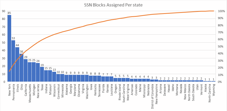
New York tops the list with 85 SSN Blocks assigned. If we add up the top 27 states, until we get to Oregon, that accounts for 80% of the blocks that were originally allocated.
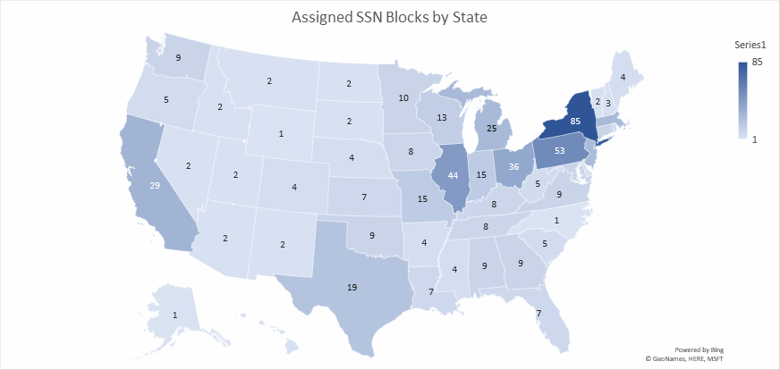
This map shows the data in the top plot as a heat map across the United States.
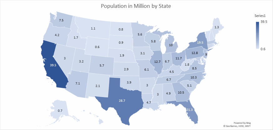
When the Original SSN allocation data is compared to the population heat map of the United States, we see a major differences in the original plan and allocation compared to how the population is actually distributed as of 2019. California makes up 12% of the US population, followed by Texas with 8.5%, Florida with 6.4% and finally New York with 5.9%. The data for these plots presented in the following table.
| State | Population (M) | SSN Blocks |
|---|---|---|
| Alabama | 4.9 | 9 |
| Alaska | 0.7 | 1 |
| Arizona | 7.1 | 2 |
| Arkansas | 3 | 4 |
| California | 39.5 | 29 |
| Colorado | 5.7 | 4 |
| Connecticut | 3.6 | 10 |
| Delaware | 1 | 2 |
| District of Columbia | 0.7 | 3 |
| Florida | 21.3 | 7 |
| Georgia | 10.5 | 9 |
| Hawaii | 1.4 | 2 |
| Idaho | 1.7 | 2 |
| Illinois | 12.7 | 44 |
| Indiana | 6.7 | 15 |
| Iowa | 3.1 | 8 |
| Kansas | 2.9 | 7 |
| Kentucky | 4.5 | 8 |
| Louisiana | 4.7 | 7 |
| Maine | 1.3 | 4 |
| Maryland | 6 | 9 |
| Massachusetts | 6.9 | 25 |
| Michigan | 10 | 25 |
| Minnesota | 5.6 | 10 |
| Mississippi | 3 | 4 |
| Missouri | 6.1 | 15 |
| Montana | 1.1 | 2 |
| Nebraska | 1.9 | 4 |
| Nevada | 3 | 2 |
| New Hampshire | 1.3 | 3 |
| New Jersey | 9 | 24 |
| New Mexico | 2.1 | 2 |
| New York | 19.5 | 85 |
| North Carolina | 10.3 | 1 |
| North Dakota | 0.8 | 2 |
| Ohio | 11.7 | 36 |
| Oklahoma | 3.9 | 9 |
| Oregon | 4.2 | 5 |
| Pennsylvania | 12.8 | 53 |
| Rhode Island | 1.1 | 5 |
| South Carolina | 5.1 | 5 |
| South Dakota | 0.9 | 2 |
| Tennessee | 6.7 | 8 |
| Texas | 28.7 | 19 |
| Utah | 3.2 | 2 |
| Vermont | 0.6 | 2 |
| Virginia | 8.5 | 9 |
| Washington | 7.5 | 9 |
| West Virginia | 1.8 | 5 |
| Wisconsin | 5.8 | 13 |
| Wyoming | 0.6 | 1 |
NumChk
info@numchk.com